This is my first post here.
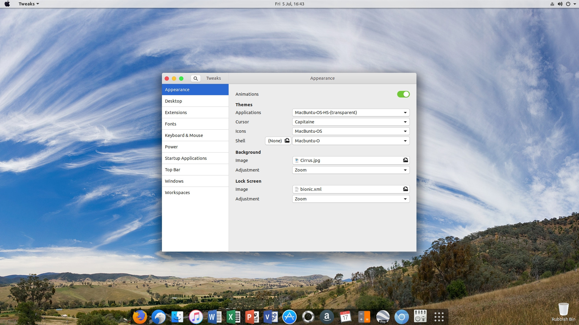
I run Ubuntu 18.04 and I recently installed the MacBuntu theme packages that are available.
Looks great, the only thing is -- I would like to know if anyone knows how to remove the shadow effect on text and icons that you get on the top bar when using the MacBuntu-O shell theme?

Does anyone perhaps know the relevant section of code to edit in the relevant gnome-shell.css file?
PS -- it creates the shadow effect no matter the font used.
Edit: as requested, what I think is the relevant part(s) of the code in the gnome-shell.css file:
/* Text Styles */

/* default text style */
stage {
    font-family: sfns display, product sans, helvetica, open sans, source sans pro, segoe ui, ubuntu, nokia pure text, lucida grande, cantarell, sans-serif;
    font-size: 11pt;
    color: #333;}

/* links */
.shell-link {
    color: #0000ff;
    text-decoration: underline;}

.shell-link:hover {
    color: #0000e0;}

/*medium 12 pt*/
.nm-dialog-item,
.calendar-month-label,
.calendar-day,
.datemenu-today-button,
.message-list-section-title,
.message-content,
.notification-banner .message-title,
.notification-banner .message-content,
.app-well-menu, {
font-size:100%}

/*large 18pt*/
.headline,
.no-frequent-applications-label,
.show-processes-dialog-subject,
.mount-question-dialog-subject,
.end-session-dialog-subject,
.prompt-dialog-headline,
.login-dialog-title,
.nm-dialog-header,
.no-network-label {
font-size: 120%;}

/* small */
.run-dialog-error-label,
.end-session-dialog-app-list-item-description,
.show-processes-dialog-app-list,
.show-processes-dialog-app-list-item-name,
.prompt-dialog-error-label,
.prompt-dialog-info-label,
.prompt-dialog-null-label {
    font-size: 90%;}

/* small bold*/
.dash-label,
.window-caption,
.switcher-list,
.app-well-app .overview-icon,
.show-apps .overview-icon,
.grid-search-result .overview-icon,
.login-dialog-banner,
.summary-source-counter {
    font-size: 90%;
    font-weight: bold;}


/* Panel */

#panel {
    background-gradient-direction:none;
    background-color: rgba(255,255,255,0.75);
/*    background-color: rgba(46,51,56,0.9);
    border:1px solid rgba(200,200,200,.5);*/
    box-shadow: 0px 1px 3px 1px rgba(0,0,0,0.5);
    border: 0px solid rgba(90,105,111,0.5);
 /*    box-shadow: 0px 0px 0px 1px rgba(0,0,0,0.15);*/
    border-top:0px;border-right:0px;border-left:0px;
    font-weight: bold;
    height: 26px;}
#panel:overview {
    background-color: transparent;
    border-color: transparent;
    box-shadow: inset 0px rgba(0,0,0,0)}
#panel:overview .panel-button {
      color: rgba(255,255,255,.5);
      border-radius: 0px 0px 4px 4px}
#panel:overview .panel-button:hover,
#panel:overview .panel-button:active {color:white}
#panel:overview #panelActivities:active,
#panel:overview #panelActivities:overview {
    color:transparent
}

#panel.unlock-screen,
#panel.login-screen {
    background-color: transparent;}

#panelLeft, #panelCenter {
    spacing: 4px;}

#panelLeft:ltr {
    padding-right: 4px;}

#panelLeft:rtl {
    padding-left: 4px;}

#panelRight:ltr {
    padding-left: 4px;}

#panelRight:rtl {
    padding-right: 4px;}

.panel-corner {
    -panel-corner-radius: 0px;
    -panel-corner-background-color: transparent;
    -panel-corner-border-width: 0px;
    -panel-corner-border-color: transparent;}

.panel-corner:active,
.panel-corner:overview,
.panel-corner:focus {
    -panel-corner-border-color: transparent;}

.panel-corner.lock-screen,
.panel-corner.unlock-screen,
.panel-corner.login-screen {
    -panel-corner-background-color: transparent;
    -panel-corner-border-color: transparent;}

#appMenu {
    spinner-image: url("resource:///org/gnome/shell/theme/process-working.svg");
  padding: 0 8px 0 0px;
  spacing: 4px;
    font-weight: bold}

/* used for the app menu header only */
.label-shadow {
    color: rgba(0,0,0,0.0);}
.panel-button #appMenuIcon {
    app-icon-bottom-clip: 0px;
    height: 0px;
    width: 12px;}
.panel-button:active #appMenuIcon,
.panel-button:checked #appMenuIcon,
.panel-button:focus #appMenuIcon {
    app-icon-bottom-clip: 0px;}
.app-menu-icon {
    width: 0px;
    height: 0px;
    margin: 4;
    -st-icon-style: regular;}
.panel-button {
    -natural-hpadding: 6px;/*jarak item2 panel def 12px*/
    -minimum-hpadding: 4px;
    font-weight: normal;
    color: #333;/*tulisan toolbar scr umum*/
    transition-duration: 200ms;/*nonstatus*/}
.panel-button:hover {
    background-color: #4a90d9;
    color: white;
    text-shadow:white 0px 0px 0px;}
.panel-button:active,
.panel-button:overview,
.panel-button:focus {
/*    border-image: url("panel-button-border.svg") 6 10 0 2;
    background-image: url("panel-button-highlight-wide.svg");*/
    border-image: none;
    background-image: url("./assets/panel-button-highlight-wide.svg");
    background-size:contain;
    color: white;
    text-shadow:white 0px 0px 0px;
    background-color: #0169d9;
    box-shadow: inset 0px 0 0 rgba(0,0,0,0);}
.panel-status-button:active,
.panel-status-button:checked,
.panel-status-button:focus {
    background-image: url("./assets/panel-button-highlight-narrow.svg");
    background-size: contain;}
.panel-button:active > .system-status-icon,
.panel-button:checked > .system-status-icon,
.panel-button:focus > .system-status-icon {
    icon-shadow:white 0px 0px 0px;}

#panel.unlock-screen .panel-button,
#panel.lock-screen .panel-button,
#panel.login-screen .panel-button {
    color: #e6e6e6;}
#panel.unlock-screen .panel-button:hover,
#panel.lock-screen .panel-button:hover,
#panel.login-screen .panel-button:hover,
#panel.unlock-screen .panel-button:active,
#panel.lock-screen .panel-button:active,
#panel.login-screen .panel-button:active,
#panel.unlock-screen .panel-button:focus,
#panel.lock-screen .panel-button:focus,
#panel.login-screen .panel-button:focus {
    color: white;
}

.panel-menu {
    -boxpointer-gap: 1px;}
.panel-status-indicators-box,
.panel-status-menu-box {
    spacing: 2px;}


/* Replaces the activities text with a custom image. Height and width should use the same size as the image file. */
#panelActivities {
    border: none;
    background-image: url("./assets/distributor.svg");
    background-position: center 20 20;
    width: 48px;
    height: 28px;
    color: rgba(0,0,0,0);
font-weight:bold;
transition-duration:300ms;
}

#panelActivities:hover {
    /*background-image:  url("./assets/distributor-logo.svg");
        background-gradient-direction:none;
        background-color:transparent;*/
transition-duration:300ms;
    background-image: url("./assets/distributor-over.svg");
        background-gradient-direction:none;
}
#panelActivities:active,
#panelActivities:overview {
    background-image:  url("./assets/distributor-active.svg");
        background-color:transparent;
        background-gradient-direction:none;
        border-image:none;
}

.system-status-icon {
    icon-size: 1.09em;
    padding: 0 4px;
}

.aggregate-menu {
    width: 300px /*old=320*/;}
.aggregate-menu .popup-menu-icon {
    padding: 0 4px;
}