I'm struggling to create a graph that is supposed to end up looking like this:
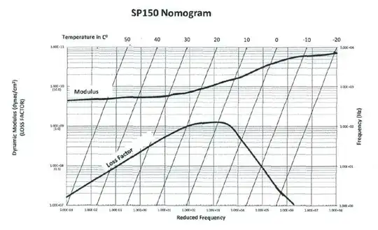
I have been able to graph everything except for the secondary x-axis at the top for temperature in degrees Celsius. Is this possible? I have the data points for where the modulus and loss factor intersect with each temperature line, but I do not have any other values regarding the temperature. If it can't be done, is there any way I could perhaps combine a contour graph with a scatter plot?
Thanks in advance
EDIT: Here's a little sample of the data that I have.
Loss Factor
Reduced Frequency   Frequency      Loss Factor       Temperature
1.53E-03            1.92E+00         1.91E+07         50
4.85E-03            3.02E+00         3.00E+07
9.89E-03            3.90E+00         3.87E+07
1.80E-02            5.04E+00         5.00E+07
Modulus
Reduced Frequency   Frequency   Dynamic Modulus Temperature
1.07E-03            4.49E+02    4.49E+09
3.06E-03            4.67E+02    4.67E+09
8.34E-03            4.86E+02    4.86E+09
9.93E-03            4.86E+02    4.86E+09
2.20E-02            4.82E+02    4.82E+09
4.42E-02            4.87E+02    4.87E+09          50


    50 Degrees Celsius
   Reduced Frequency    D. Mod.
    2.77E-01            1.00E+11
    1.00E-03            1.00E+07
You can see that I only have the points of intersection of the temperature lines and the modulus/loss factor. I also I have the points at the end of each temperature line in relation to the y axis (dynamic modulus) and the x axis (reduced frequency).