53

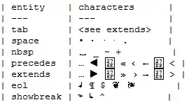
The line lengths in this code section in the original question are not equal. See below for the corrected version. I'm unsure as to how this may have affected the images in question

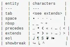
| entity    | characters    |
| ---       | ---           |
| tab       | <see extends> |
| space     | • ∙ · ⋅ .     |
| nbsp      | ␣ _ ~ +       |
| precedes  | … ◀ ❮ « ‹ ← ⟨ < |
| extends   | … ▶ ❯ » › → ⟩ > |
| eol       | ↲ ¶ $ ❦ ❧     |
| showbreak | ↪ ↳ ^         |
Vim (the only editor that shows it correctly, without misaligning!):

Enter image description here

Emacs:

Enter image description here

Sublime Text:

Enter image description here

Visual Studio Code:

Enter image description here

Notepad:

enter image description here

The font is the same: Consolas.

Why does it happen on Windows 7 for me? Do you have the same issue on Windows 10? How can I stop it?

[Update, see comments under Tetsujin's answer] Here is how I see the code example from the top of my question:

Enter image description here

(The browser is Chromium-based Edge. The font is Consolas.)

Edit
Line-length corrected version of the code section…

| entity    | characters      |
| ---       | ---             |
| tab       | <see extends>   |
| space     | • ∙ · ⋅ .       |
| nbsp      | ␣ _ ~ +         |
| precedes  | … ◀ ❮ « ‹ ← ⟨ < |
| extends   | … ▶ ❯ » › → ⟩ > |
| eol       | ↲ ¶ $ ❦ ❧       |
| showbreak | ↪ ↳ ^           |
Tetsujin
  • 47,296
  • 8
  • 108
  • 135
user90726
  • 863
  • 1
  • 7
  • 14
  • 13
    Vim simply can't avoid aligning the text, [even proportional fonts are rendered on a grid](https://vi.stackexchange.com/q/588/1081). – Ruslan Aug 30 '21 at 22:00
  • @Ruslan Thanks! So it seems by suspects about Vim were at least partly correct (see the first comment under Tetsujin's answer). – user90726 Aug 31 '21 at 00:47
  • 5
    I once saw an actual, honest-to-god "fi" ligature. In a dead-tree book. *In a monospaced block of code*. I mean sure, everything was still equally spaced, it's just that one of those equal spaces had two letters crammed into it. – Bass Sep 01 '21 at 11:58
  • 1
    @Bass This could be Fira Mono font. It is free and as far as I remember, it has ligatures. – user90726 Sep 01 '21 at 12:06
  • 2
    @Bass you can of course do that in any unicode monospace font: `int flip(int biff, string str) {...}` – leftaroundabout Sep 01 '21 at 14:18
  • 2
    I can't agree with you that Vim was _"the only editor that shows it correctly, without misaligning!"_. While Vim certainly performed the alignment correctly, as far as rendering the characters "correctly" it was the worst of them all. – skomisa Sep 02 '21 at 00:09

2 Answers2

67

The line lengths in the initial question were not all equal, necessitating some revision to this answer.

They're all using different font substitutions for glyphs not contained in Consolas itself [or failing to find substitutions in some cases*] & the subs are not monospace [or not the exact same size monospace].

One way to test would be open the font in an editor & see which glyphs it is missing.

enter image description here

It's harder to tell what is being substituted, unfortunately.

Complete 'cure' would be to use a font that already contains all your required glyphs, so no subs would be necessary.

Deja Vu Sans Mono is always a good (& nicely cross-platform) candidate for being more comprehensive than others

enter image description here

& Wikipedia has a list of mono-spaced fonts at https://en.wikipedia.org/wiki/List_of_monospaced_typefaces

*Vim, emacs, Sublime & Notepad all failed to substitute all the chars, so ironically Vim "worked the best" because it actually "failed the best".

Incidentally, I'm looking at this on Mac, which is "supposed to be good at this kind of thing"… proving no system is perfect - it screws two lines using Stack Exchange's standard fonts…

enter image description here

Edit
I just noticed the line lengths in the code section at the top of the question were not all equal, mainly 15 chars between pipes but 2 lines at 17 chars… which kind of throws everything out.

Revised line-length-corrected pic of Mac's font substitution using SE's defaults…

enter image description here

Which now renders correctly (Did I mention Mac is supposed to be good at this stuff? ;)

Line-length-corrected image of Deja Vu Sans, Menlo [seems to be SE Mac default] & Consolas [which does not fare well in this comparison.]

enter image description here

Tetsujin
  • 47,296
  • 8
  • 108
  • 135
  • _"So ironically Vim "worked the best" because it actually 'failed the best'"_ - Look at fleurons (❦ ❧). In Vim, the space between them is very thin, so it seems to me that Vim sacrificases whitespace to keep aligning, while other editors do it in the opposite way. I also hear somewhere that some characters (e.g. Chinese hieroglyphs) can have the width of 1.25, 1.5 or 2 "normal" characters. So I'm not sure your answer is really correct. But I upvoted it and I will probably accept it later (or not). – user90726 Aug 30 '21 at 11:27
  • 3
    It shouldn't need to 'sacrifice' anything, it should be able to find monosplaced subs, as should they all - thing is… it rarely works out that way once you go much beyond standard ASCII, as very few fonts contain even a good subset of all possibilities. Substitutions in some cases will be done by the OS, other times set by the app. No method is perfect. It would be interesting to see how your OS handles even the 'code text' example at the top or your question. Mine screws the precedes & extends lines using SE's standard fonts [for Mac in my case]. – Tetsujin Aug 30 '21 at 11:36
  • Another good reason to try Deja Vu, pic added to answer – Tetsujin Aug 30 '21 at 11:39
  • 1
    _"It would be interesting to see how your OS handles even the 'code text' example at the top or your question."_ - I have added it to the question. – user90726 Aug 30 '21 at 11:53
  • Thanks - yeah, even worse than Mac handles it [kind of covered by my 'Mac is supposed to be good at this' comment in the answer] - though I don't actually know what font SE defaults to for mono on either Windows or Mac. They did mention it in Meta when they recently changed the entire look & feel, but I don't remember & can't find it just now :\ – Tetsujin Aug 30 '21 at 12:02
  • 6
    AHHH… what won't be helping is that your line lengths in your code section are not actually all the same! They're mainly 15 chars between pipes, but the two overhanging lines [shown on my Mac picture] are 17. I've edited Q & A to correct. I'd copy-pasted it to test in a Mac-native app & couldn't figure out why it **still** didn't work. – Tetsujin Aug 30 '21 at 12:20
  • 1
    @Tetsujin just finding a monospaced sub, assuming one exists, isn't enough because not all monospaced fonts are the same width. This is from LibreOffice Writer in W10 (because LOW had more monospaced fonts than MS Word, if still fewer than Android Studio's monospaced font picker does). All fonts are 10pt in size. https://i.imgur.com/396oUae.png There are also some height variations (eg Lucidia Console is slightly shorter than Luicida Sans Typewriter); I didn't include any though because the difference didn't stand out in single line samples. – Dan Is Fiddling By Firelight Aug 30 '21 at 20:06
  • Use Terminal font on Windows fixes the issue in Notepad. The OEM/DOS codepage forces a different set of subs. – throx Aug 30 '21 at 22:48
  • 2
    @jsv Yep, U+FFFD (the official replacement character in Unicode) has the same issue. Vim actually has an option that controls that behavior though (`ambiwidth`) that lets you force single width or double width for characters that have an ambiguous width. – Austin Hemmelgarn Aug 31 '21 at 02:13
  • 2
    Something [Nerd Fonts](https://www.nerdfonts.com/) patched might be preferrable, especially if one is to use extensions like powerline. – jaskij Aug 31 '21 at 15:23
  • @JanDorniak Thanks. Seems to be awesome thing. (I haven't really tried yet.) – user90726 Aug 31 '21 at 21:06
  • @jsv I can't imagine working with git without having powerline-like status info in the prompt. Seems like powerline and Nerd Fonts are mostly popular in the Linux word though. – jaskij Aug 31 '21 at 21:19
  • Hack seems to work, using the corrected version with all lines 32 chars long (tested in jEdit on Linux). It even monospaces emoji, which a cursory check suggests are derived from fontawesome – Chris H Sep 02 '21 at 10:34
9

Whenever I'm working with content like ASCII art flow charts where alignment is critical, I like to paste the content into something like Word as a sanity check. Pasting the content from your question, pressing Ctrl+A, and changing the font to Consolas resulted in:

enter image description here

Now, place the cursor after a character, and the font selector at the top of the screen will indicate which font is being used for that character. I can now see that the second-to-last dot on the "space" line is using Cambria Math, the first entry in "nbsp" is using MS Gothic, the glyphs rendered as blue boxes are Segoe UI Emoji, etc. Those all indicate characters that weren't available in Consolas. That makes it fairly easy to test various font choices and find one that has all the glyphs you need.

In the above screenshot I've also told Word to display formatting marks for whitespace characters (File > Options > Display). This typically makes it very obvious which characters are a different width than the others. In this particular example the marks blend in with the dots on the "space" line, but it's still enough to see that the dot that's roughly underneath the "x" in "extends" is narrower than the others.

bta
  • 736
  • 3
  • 8