1

I am using a combo chart and I have managed to reach as shown below

enter image description here

Below is the output that I am seeking. I am trying to add a vertical line for a specific date (say 11th Jul)

enter image description here

I googled a lot but unable to find a solution. I came across something which is closer to what I need. Embedding a vertical reference line in Excel but I am unable to achieve this as there is already a secondary axis. What is the best way to handle this?

Dhruva
  • 435
  • 3
  • 5
  • At face value, without actually trying this, could you not adapt that linked solution but instead of 0 and 1, use formulas to find the MAX and MIN values of the calls or the conversion rate so this can be plotted on the existing axis? – AdamV Nov 15 '21 at 12:58
  • Thanks for the reply @AdamV. The moment I reach step 6, the line disappears :( I also manually tried to put 0/100 as min/max values – Dhruva Nov 15 '21 at 13:48
  • Why are you trying to add a vertical line? What does it signify? I ask because perhaps there is a alternate solution that can have the same meaning. – FlexYourData Nov 15 '21 at 15:03
  • My boss wants it. That date is a cutoff date. He wants to show it that way :( – Dhruva Nov 15 '21 at 15:42

1 Answers1

2

Here is a bit of a workaround, not ideal, but could do the job. Let me know if it works for you

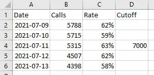
  1. Insert a 3rd column for the cutoff in your table with a value equivalent to the the max value of your axis (in this case, 7000)

enter image description here

  1. Insert a combo chart with the third series as columns

enter image description here

  1. Select the bar and adjust width and colour by Formatting the Data Series

  2. Format the left Axis so the range is between 0 and 7000

enter image description here

cybernetic.nomad
  • 5,415
  • 12
  • 25
  • Loved it. Thanks a ton! I wish instead of column, I could show it as a dotted line... (If I am not asking for too much) I decreased the gap width to 500% but could not go beyond that... – Dhruva Nov 16 '21 at 06:14
  • Filling the column with an image or texture may do the trick – cybernetic.nomad Nov 16 '21 at 16:02
  • Thanks I had already thought of that and the results were not satisfactory :D If the width could have reduced then yes, that would have helped. – Dhruva Nov 17 '21 at 09:03
  • Instead of a column, make the added series a line chart series. There is only one non-zero point. Format it to have no marker, but add a drop line, and format the drop line as a dotted line. Or add error bars, no cap, value minus only, value 100%. Format as dotted line. – Jon Peltier Feb 08 '22 at 01:42